Recipe #3: Scatterplots and Regression Lines
This recipe will show how to use Tableau to explore a linear relationship between two numeric variables. (In Tableau's vocabulary, these are measures rather than dimensions.)
We'll use the following data: https://www.dropbox.com/s/5yxs2rk1gejk9dx/USstates.xlsx?dl=0
1. Open a new workbook in Tableau.
2. Click on Connect to Data OR select New Data Source from the Data menu.
-- In the To A File section, select Microsoft Excel
-- Navigate in the file directory to where you put the data file (probably the Downloads folder)
-- Select USstates.xlsx
The file opens in the data window. You can see the variables in the columns and the cases (states) in the rows. This file has some social indicators which you can get a sense of from the label.
3. Select Sheet1 to see the variable list. State is sorted into the Dimensions list and the other variables are in the Measures list.
4. Select "edspend" and "burg10" (with control-click). Click on the Show Me tab. You'll see the scatterplot highlighted. Select scatterplot.
-- The first thing we need to do is to tell Tableau to plot not the sums of the two variables in the aggregate, but the values for each state. To do this, drag State from the Dimensions list into the Marks bin. You'll then see the plot with fifty states.
-- Right click on the plot and select Trend Lines >>> Show Trend Lines. This will compute the least squares linear regression line and add it to the graph.
5. Label the worksheet appropriately.
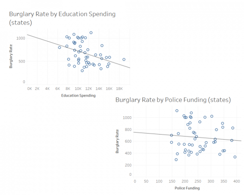
You can then repeat this recipe with other variables. I built two graphs to compare education funding and crime against police funding and crime. I put these two sheets into a dashboard, attached. I also added these two sheets to a story and then saved the story as a Powerpoint slideshow, which I've attached as a PDF.
- Log in to post comments