Submitted by Professor Shortell on Fri, 03/20/2020 - 22:19
We'll hold a virtual class meeting to look over the DataViz4 and DataViz5 notebooks.
Submitted by Professor Shortell on Mon, 03/16/2020 - 12:30
We'll look at code for DataFrames and merging data sources, and then a linear model.
Submitted by Professor Shortell on Wed, 03/11/2020 - 09:08
We'll look at code to visualize linear models using the seaborn library.
Submitted by Professor Shortell on Tue, 03/10/2020 - 09:23
This is a self-paced Introduction to Python online course that connects to some of IBM's resources (such as their Watson Studio). If you are looking for additional programming guidance and like self-directed learning, give it a try.
https://cognitiveclass.ai/courses/python-for-data-science
Submitted by Professor Shortell on Wed, 03/04/2020 - 15:49
Today, we'll look at libraries, methods, and loops.
Colab link in the comments.
Submitted by Professor Shortell on Wed, 03/04/2020 - 10:18
Assignment 4 will be the 5 minute data story you present in class on Wednesday, 3/4.
Submitted by Professor Shortell on Tue, 03/03/2020 - 18:34
We'll discuss Jupyter notebooks and step through this first notebook on Google's Colaboratory site.
You can interact with the code at Google Colab or you can download the file and open it in your own copy of JupyterLab.
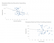
Submitted by Professor Shortell on Wed, 02/26/2020 - 09:47
This recipe will show how to use Tableau to explore a linear relationship between two numeric variables. (In Tableau's vocabulary, these are measures rather than dimensions.)
We'll use the following data: https://www.dropbox.com/s/5yxs2rk1gejk9dx/USstates.xlsx?dl=0
1. Open a new workbook in Tableau.
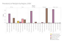
Submitted by Professor Shortell on Mon, 02/24/2020 - 08:48
Using the regional religion data, create a visualization and narrative as a dashboard and attach the image to this page. We'll discuss the results.
Information about the data: https://doi.org/10.17605/OSF.IO/SPQBC
Submitted by Professor Shortell on Wed, 02/19/2020 - 08:23
We're going to use the American National Election Study as a data source to demonstrate visual communication with Tableau dashboards.
1. First step is to learn the basics about the data source. Visit the ANES site and try to answer the following questions:
a) Who collects the data?
b) How are the data collected? and,
c) What can we say about the quality of the data source?
You should do this with every data source you consider for your project.
Pages